About
This is the brand refresh of Lowell Arts. We were asked by the client to come onto the team because, over the last 10 years, Lowell Arts has grown and evolved. As they continue that change into the future it’s time to update the look & feel to match the vision.
Objective
• A new identity that signals change and will connect with new audiences.
• A system that will create continuity across the programs.
• Templates that will reduce time creating materials.
• Consistency to build brand recognition.
• A system that will create continuity across the programs.
• Templates that will reduce time creating materials.
• Consistency to build brand recognition.
Audit
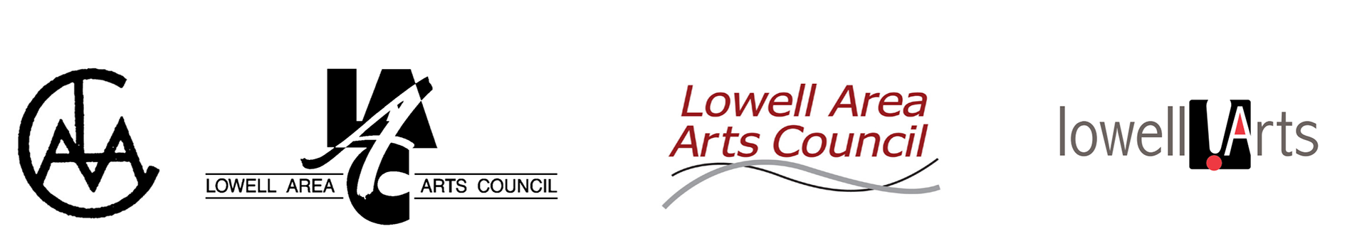
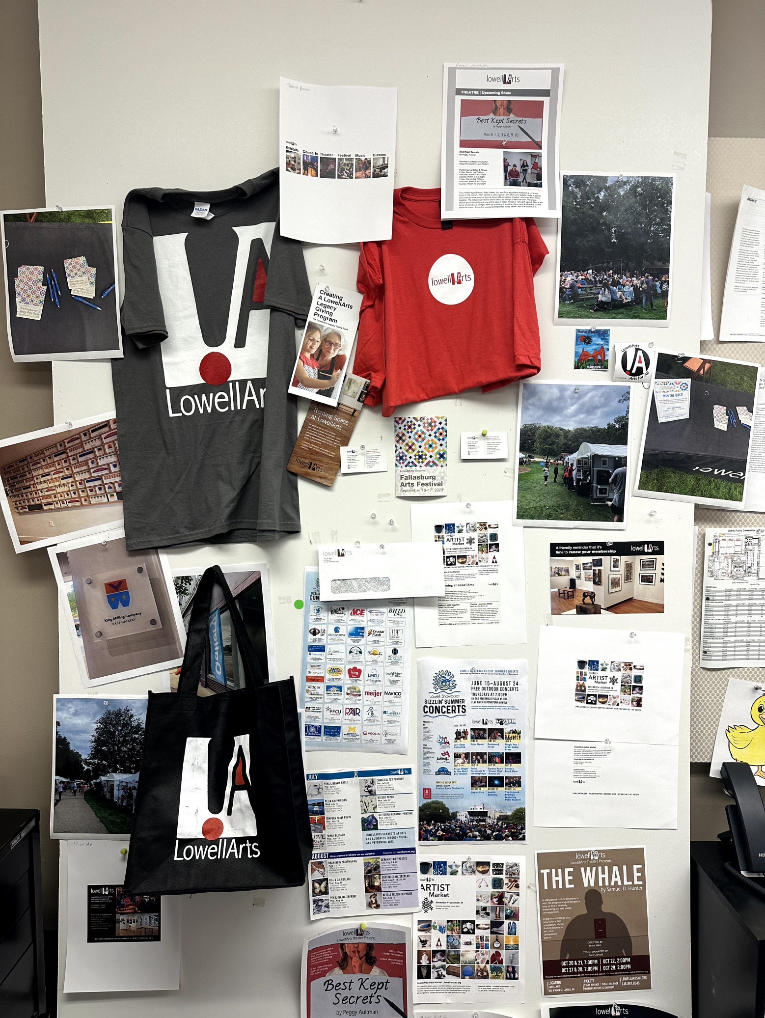
We gathered all of their current print materials to gather what touchpoints need to be considered as well as familiarize ourselves with the organization
Starting out we had a designer who pitched the idea of rebranding, we used this as a starting point for where we could take the brand.
Concepts
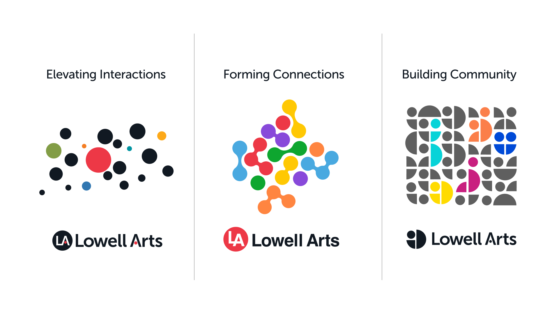
From the information that we gathered during the initial audit, we proposed three concepts for the visual language:
Elevating interactions: Focused on growth
Elevating interactions: Focused on growth
Forming connections: Focused on creating dynamic connections and creating a community built from connections
Building community: Focused on how different parts of the community are all a part of a more dynamic and vibrant whole.
Building community: Focused on how different parts of the community are all a part of a more dynamic and vibrant whole.
Design System
Visual Language
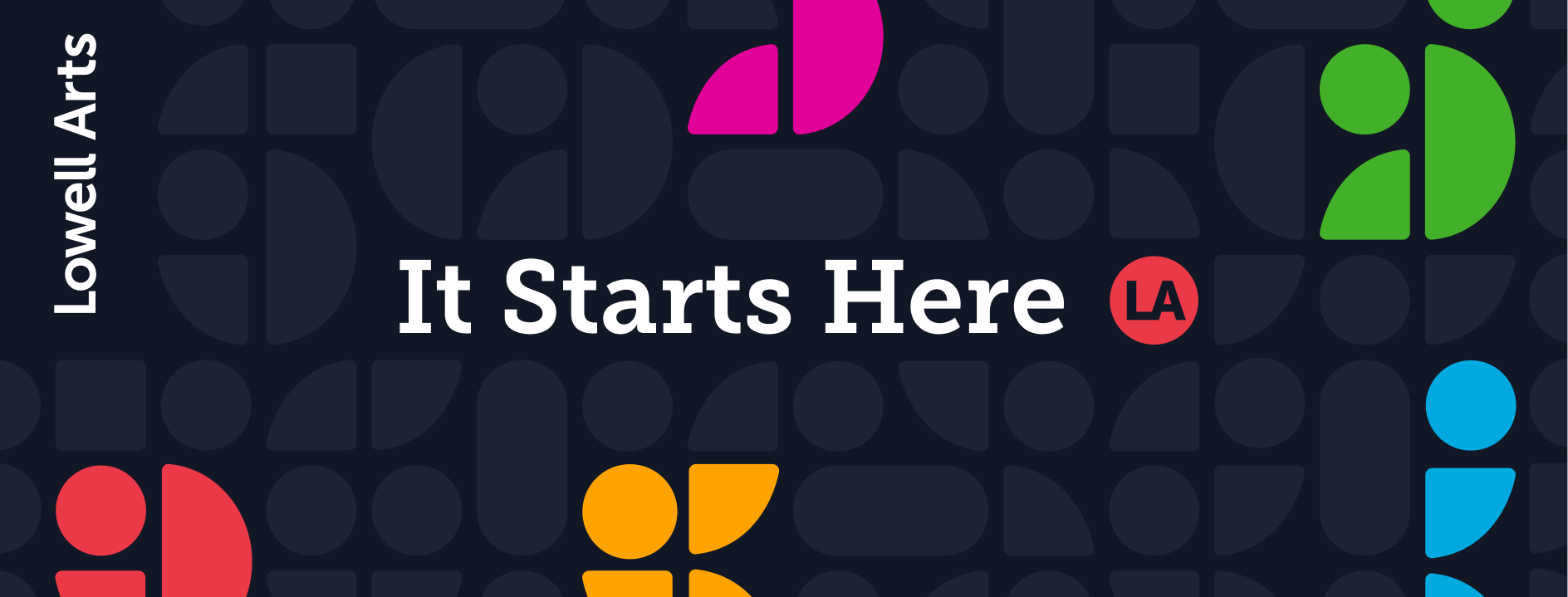
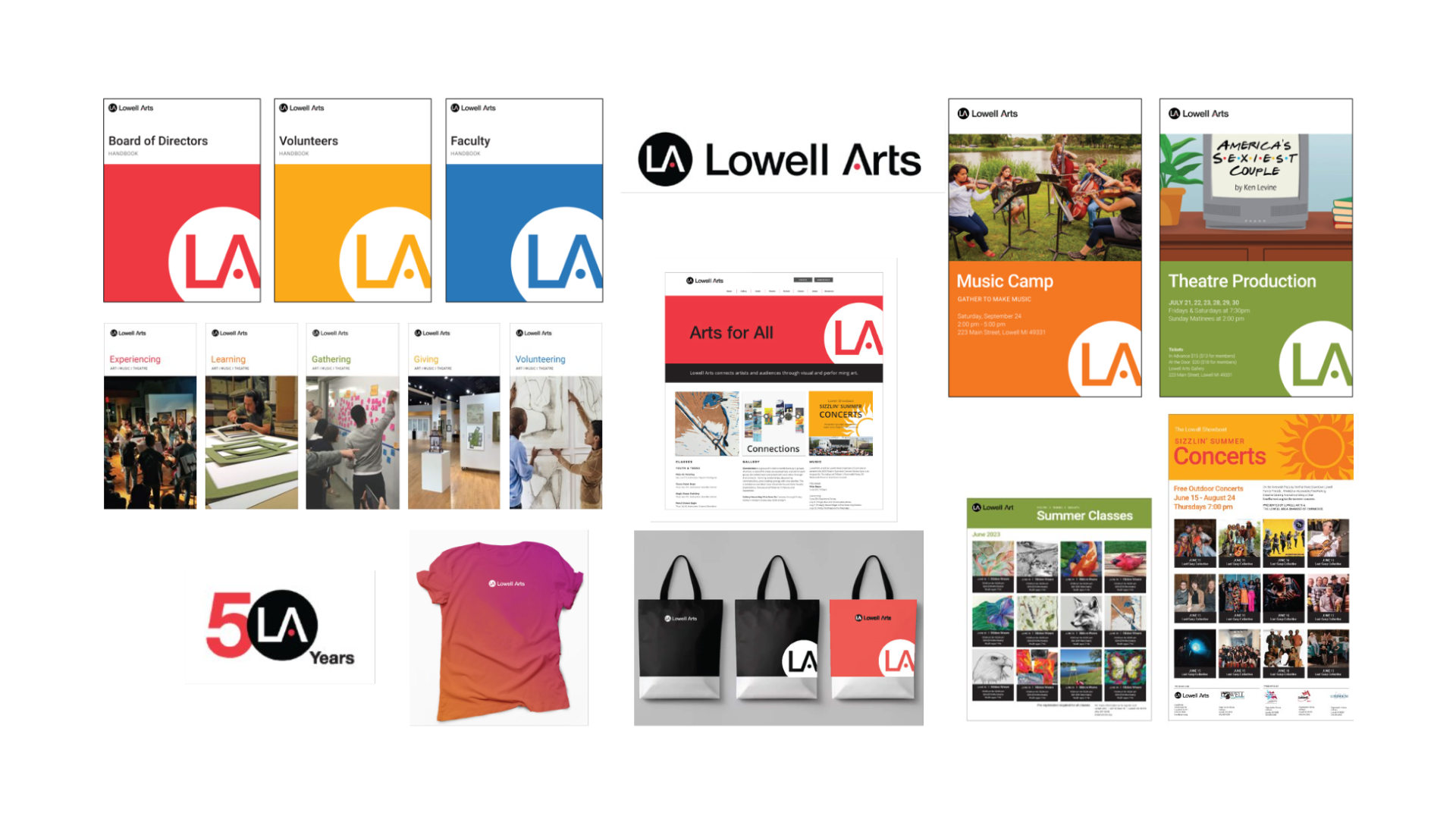
Logo System
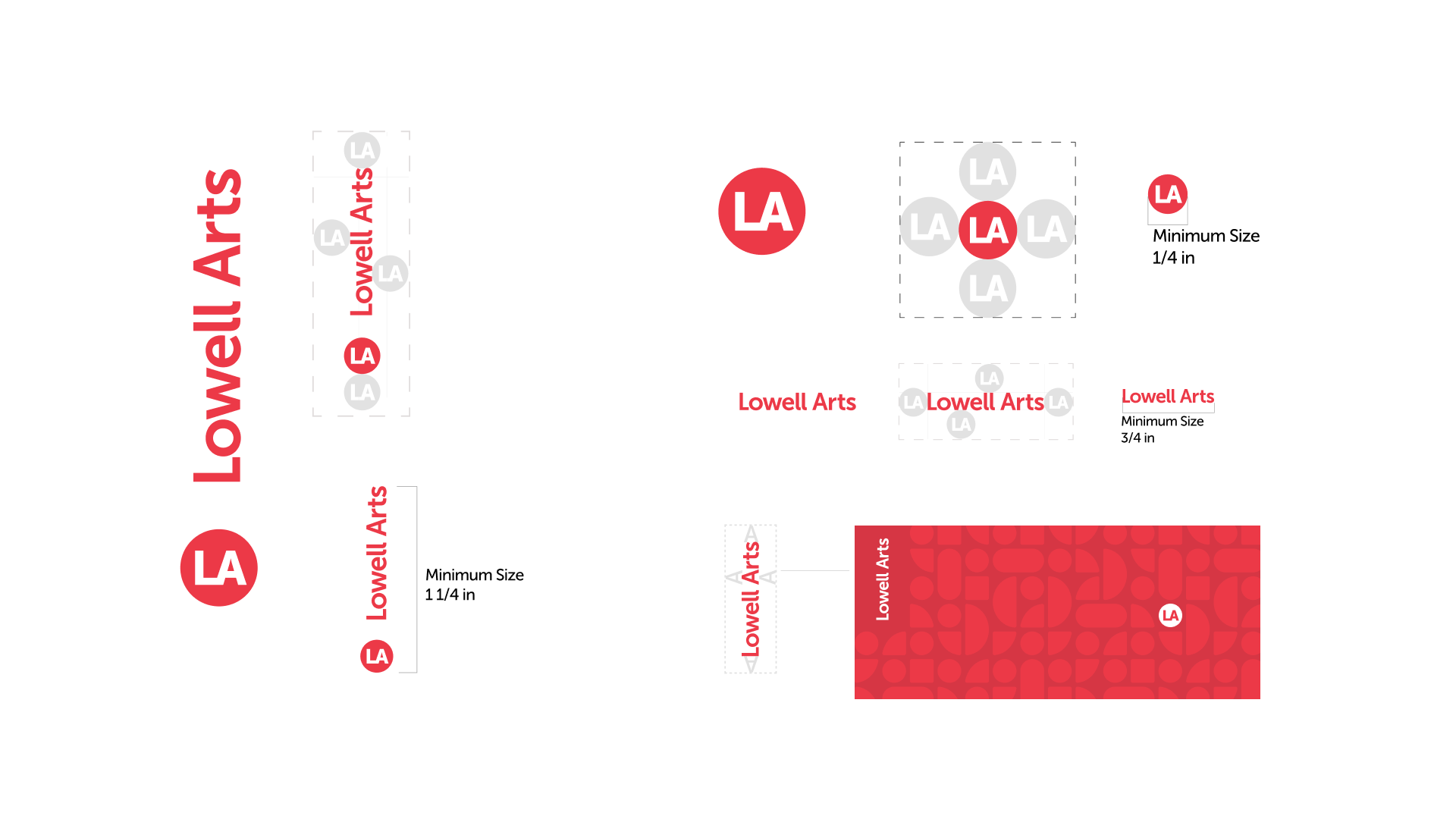
Then we created the logo system consisting of the signature which can be broken into the word mark and the brandmark. There is also a special case horizontal mark for when the vertical mark cannot fit.
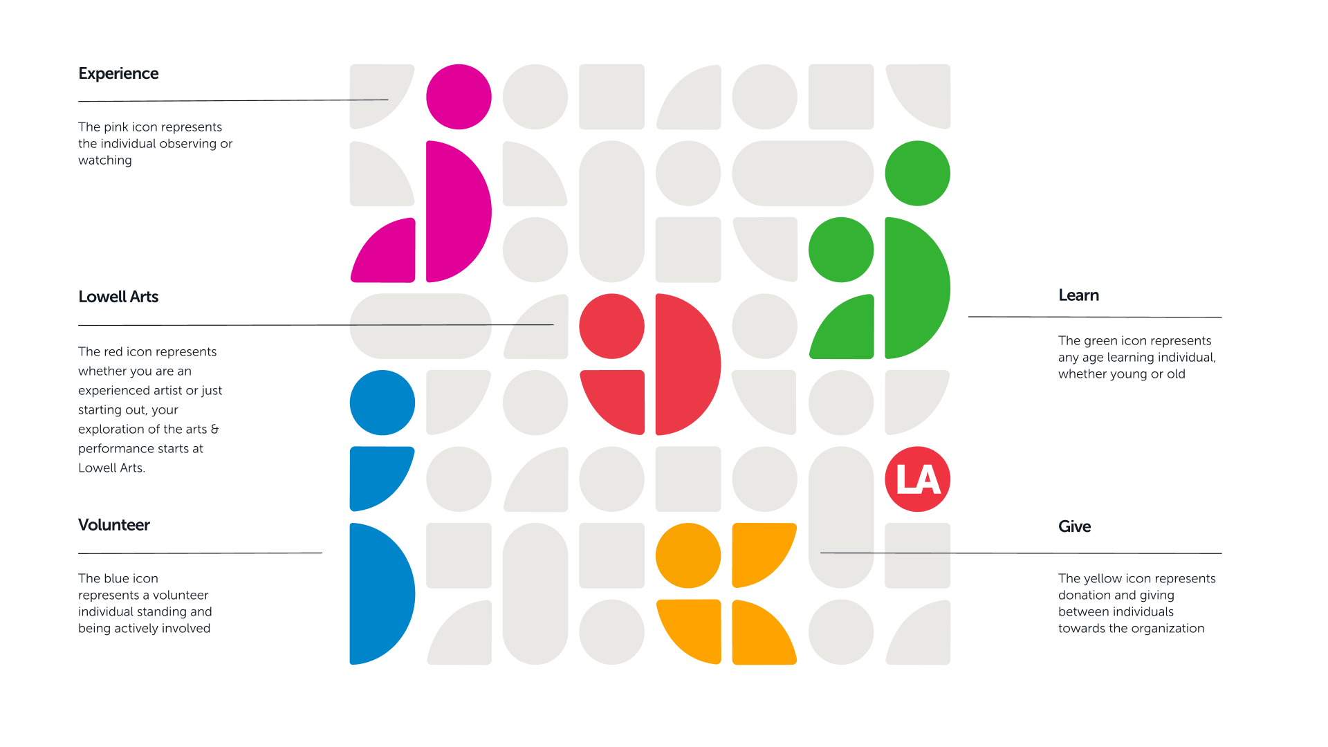
The vertical orientation is used to show the upward projection of Lowell Arts. The brandmark acts kinetic through its application to show that Lowell Arts is always changing and moving.
The vertical orientation is used to show the upward projection of Lowell Arts. The brandmark acts kinetic through its application to show that Lowell Arts is always changing and moving.
I was personally responsible for creating the clear spacing around the mark, this was to help ensure the impact and presence of the logo in application. As well as create a guide for when other designers go to execute touchpoints for this brand.
Color Usage and Typography
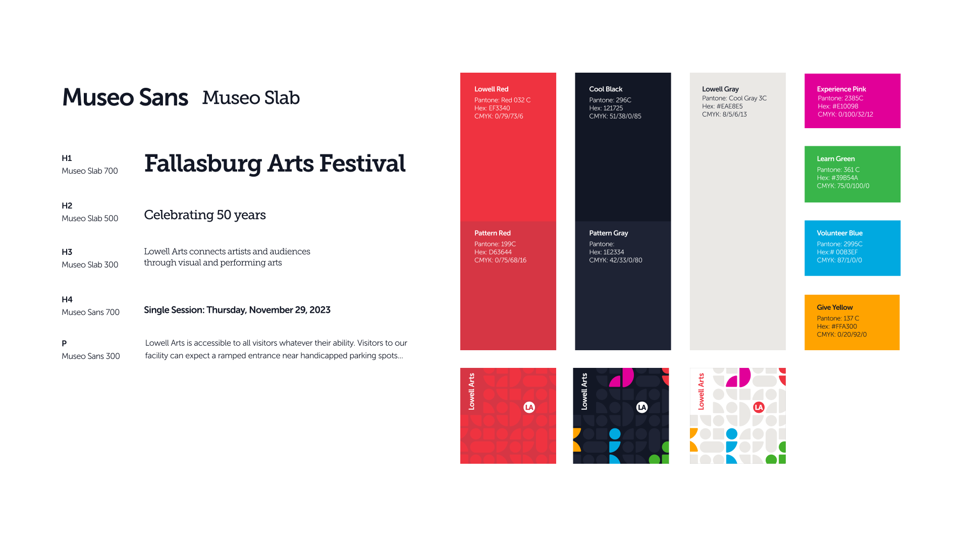
Museo Sans was chosen as the primary type because of its clean and friendly appearance it was paired with Museo Slab because of its nice structure while keeping its friendly appearance.
For the colors we kept the original Red and grey from their color palette to help keep the recognition of the brand. The pillar colors are vibrant to represent the vibrancy of the brand.
Photography
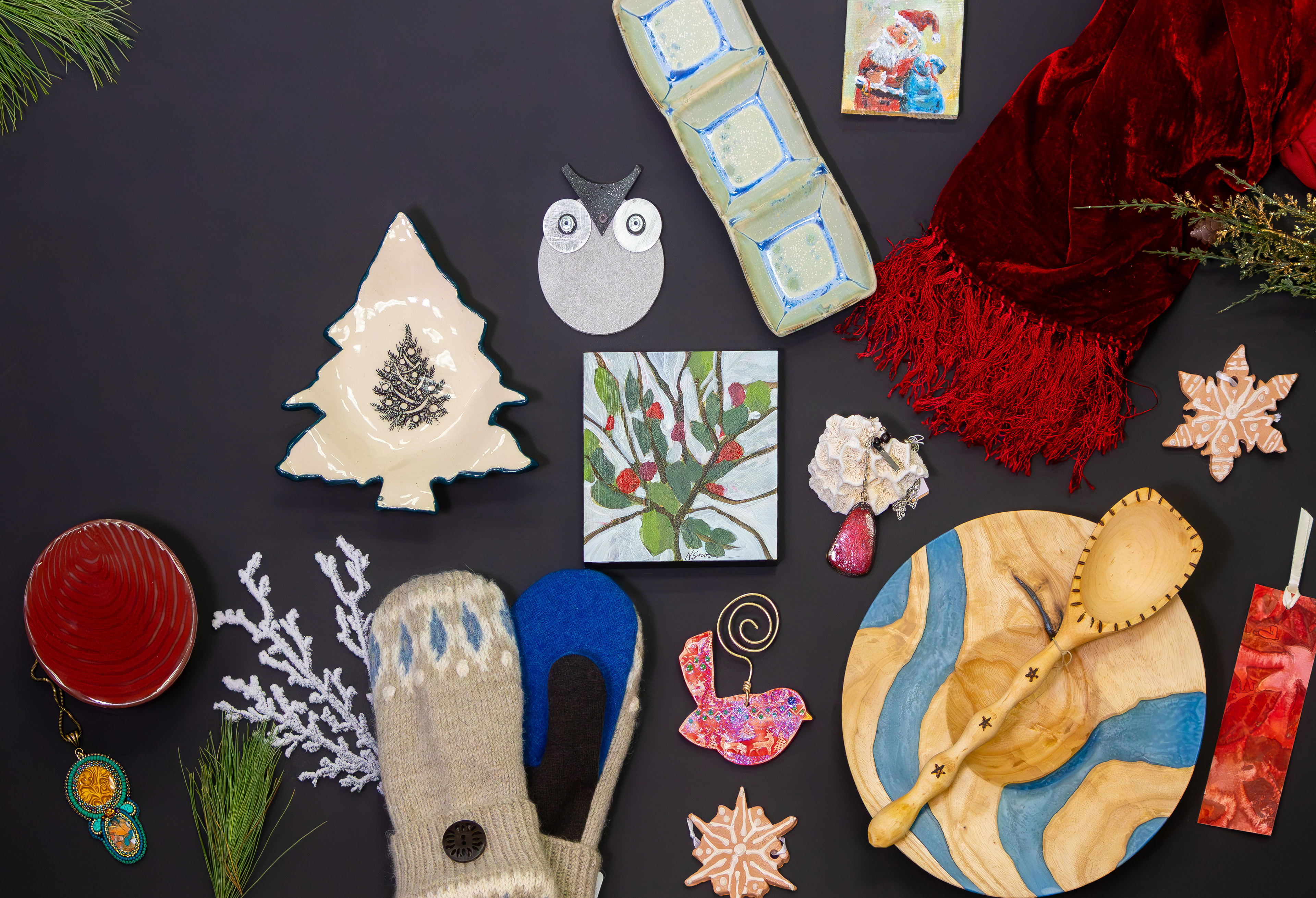
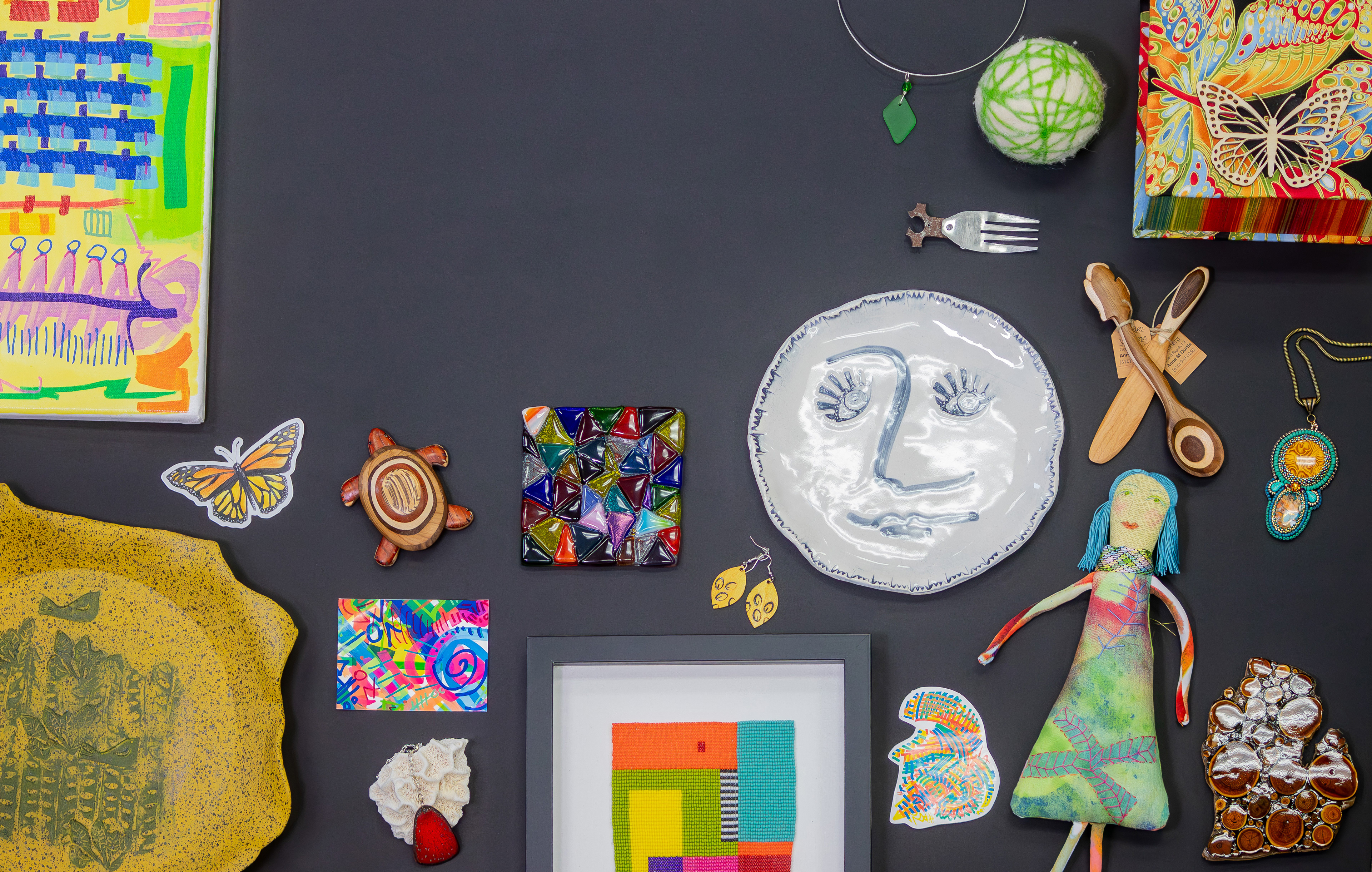

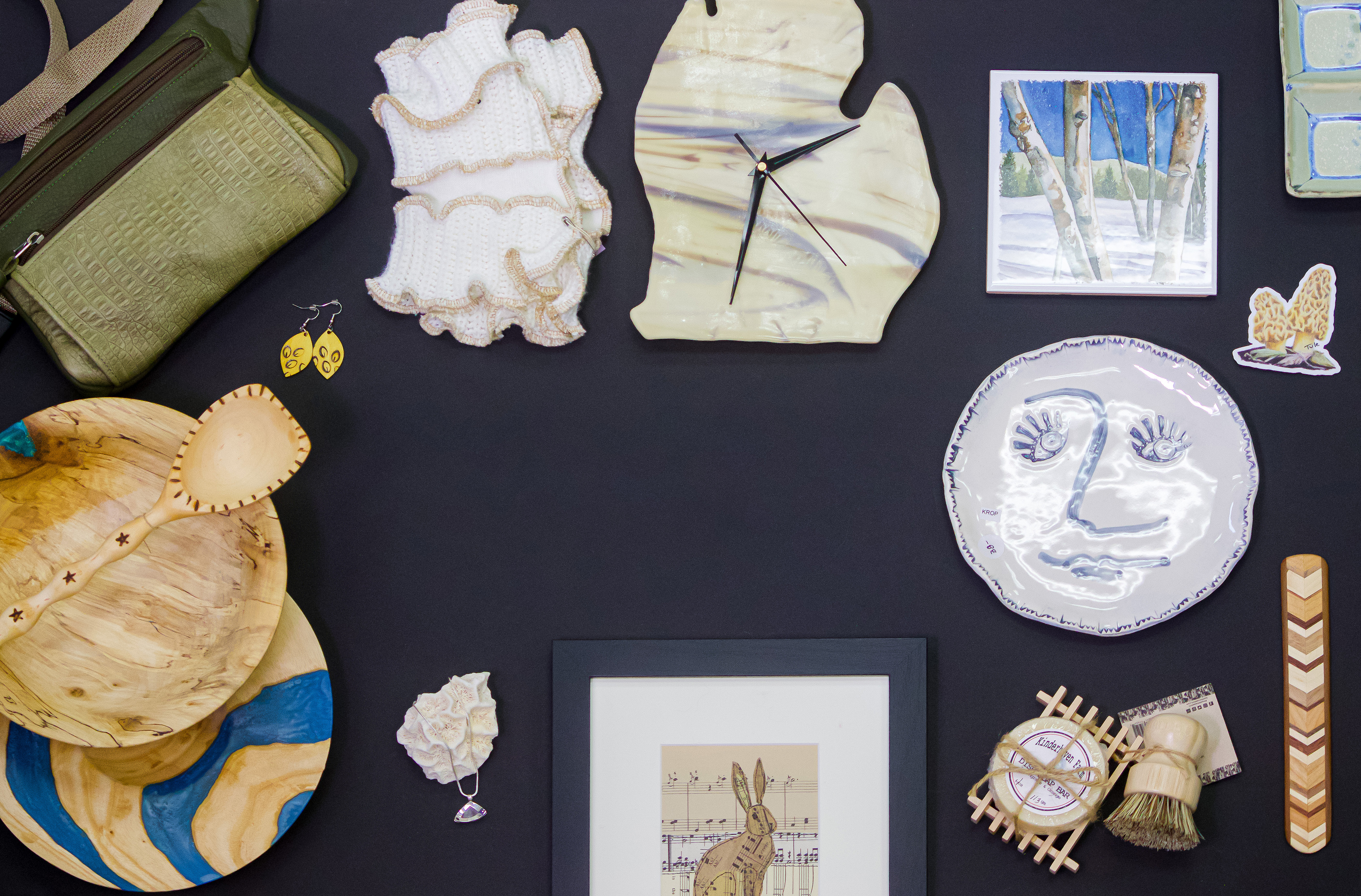


While establishing the brand we explored photography styles. My team and I art directed a photo shoot of different art pieces for Lowell’s artist market emulating the pattern that we had created. I was in charge of capturing and editing the photos. It was important for me to keep the photos vibrant to match the visual language and colors we had already established.
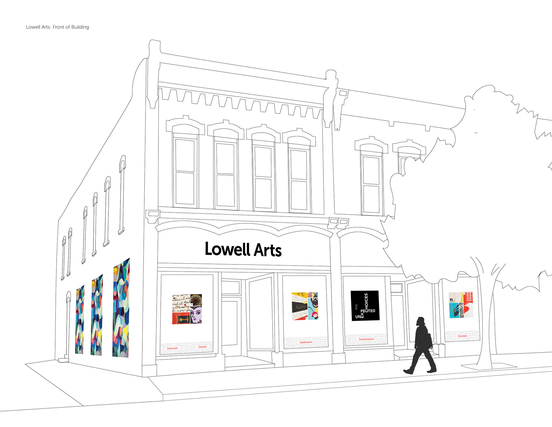
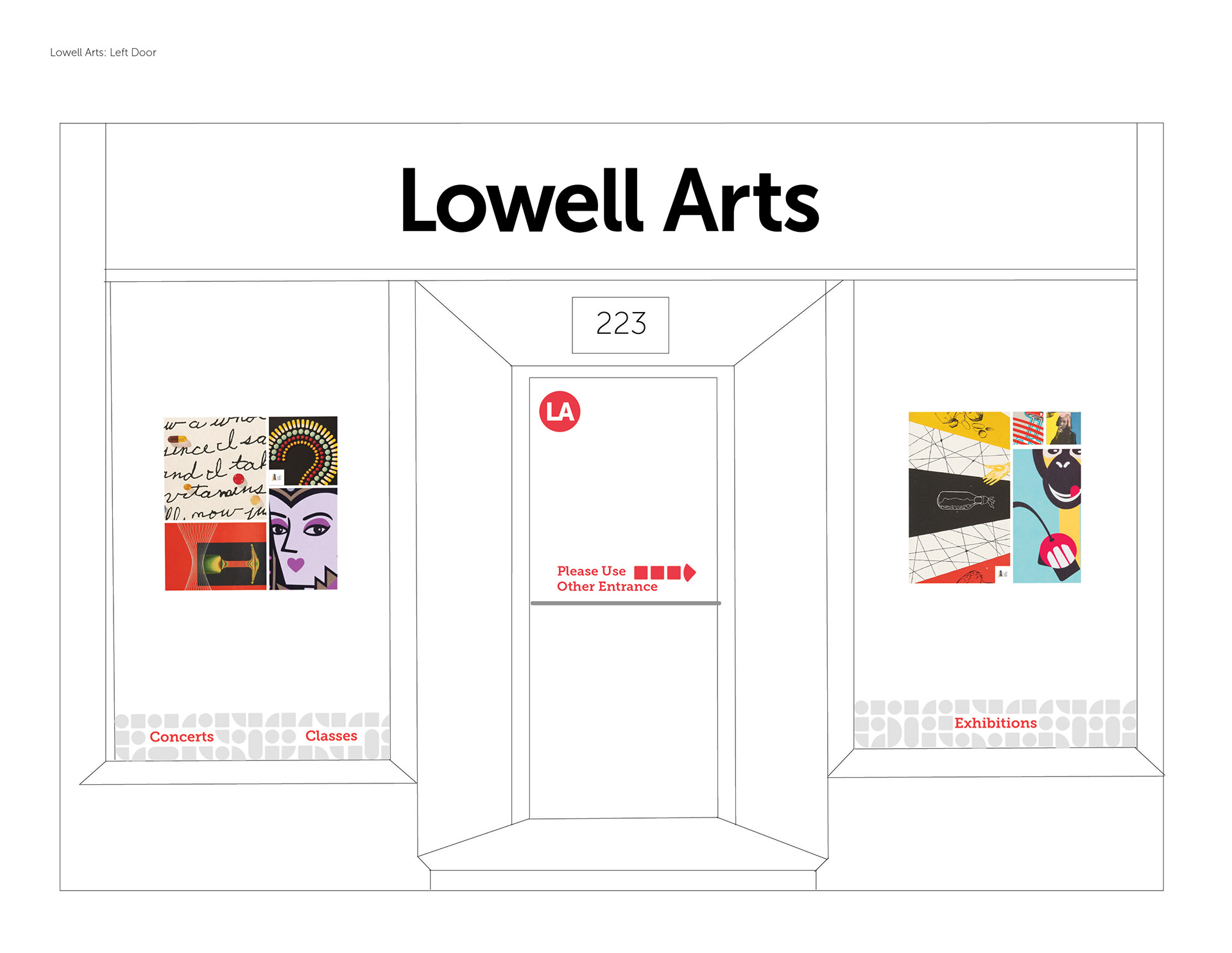
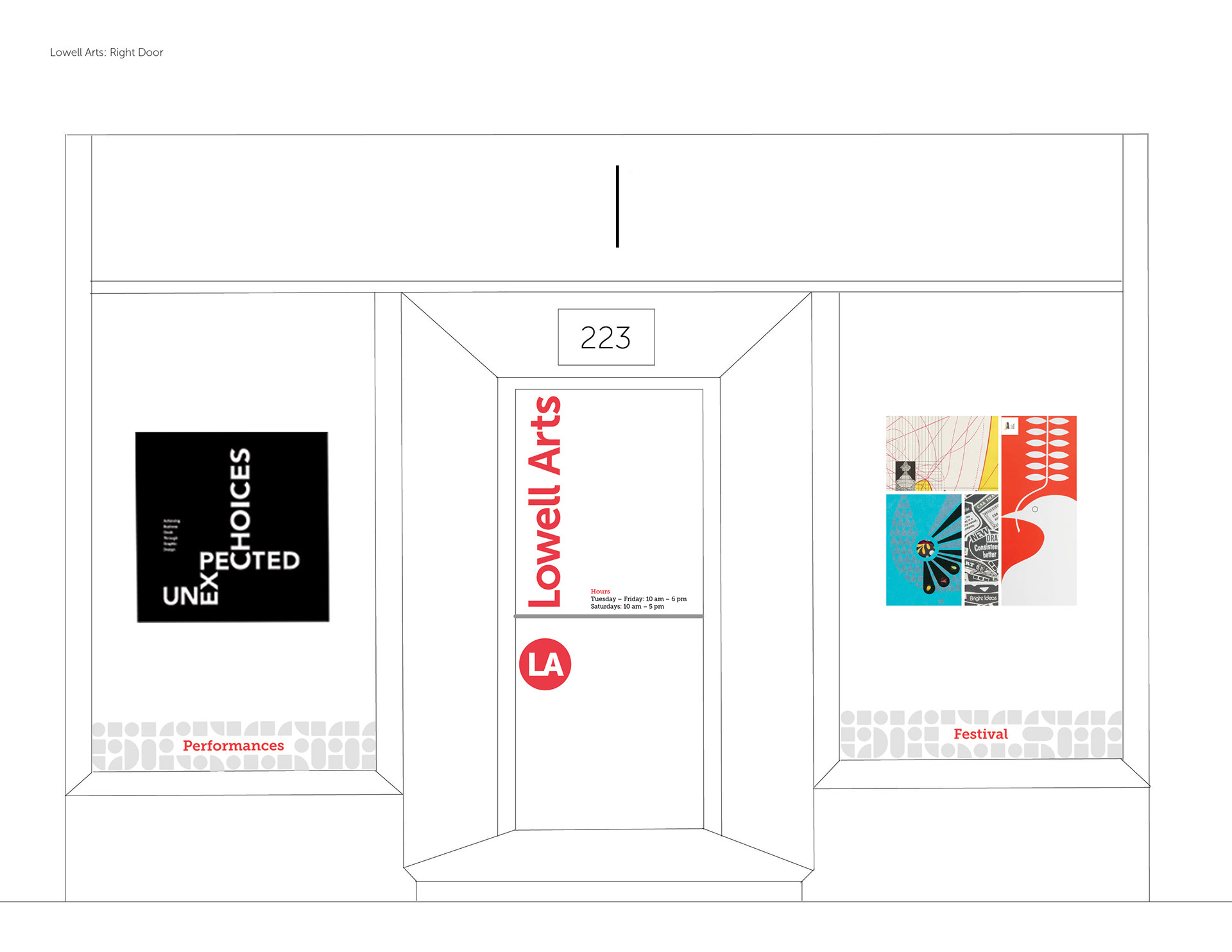
Brand Application
Business Stationery
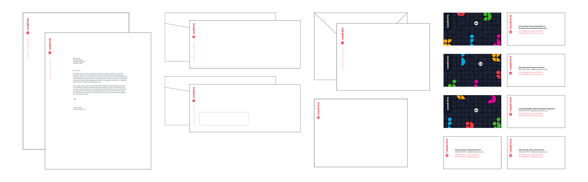
As a group we created the business stationery, using the bug to anchor the type.
A system of business cards was also created. The backs highlight all of Lowell's pillars and show the kinetic energy through the different placement of the bug and pillars.
A system of business cards was also created. The backs highlight all of Lowell's pillars and show the kinetic energy through the different placement of the bug and pillars.
Social Media
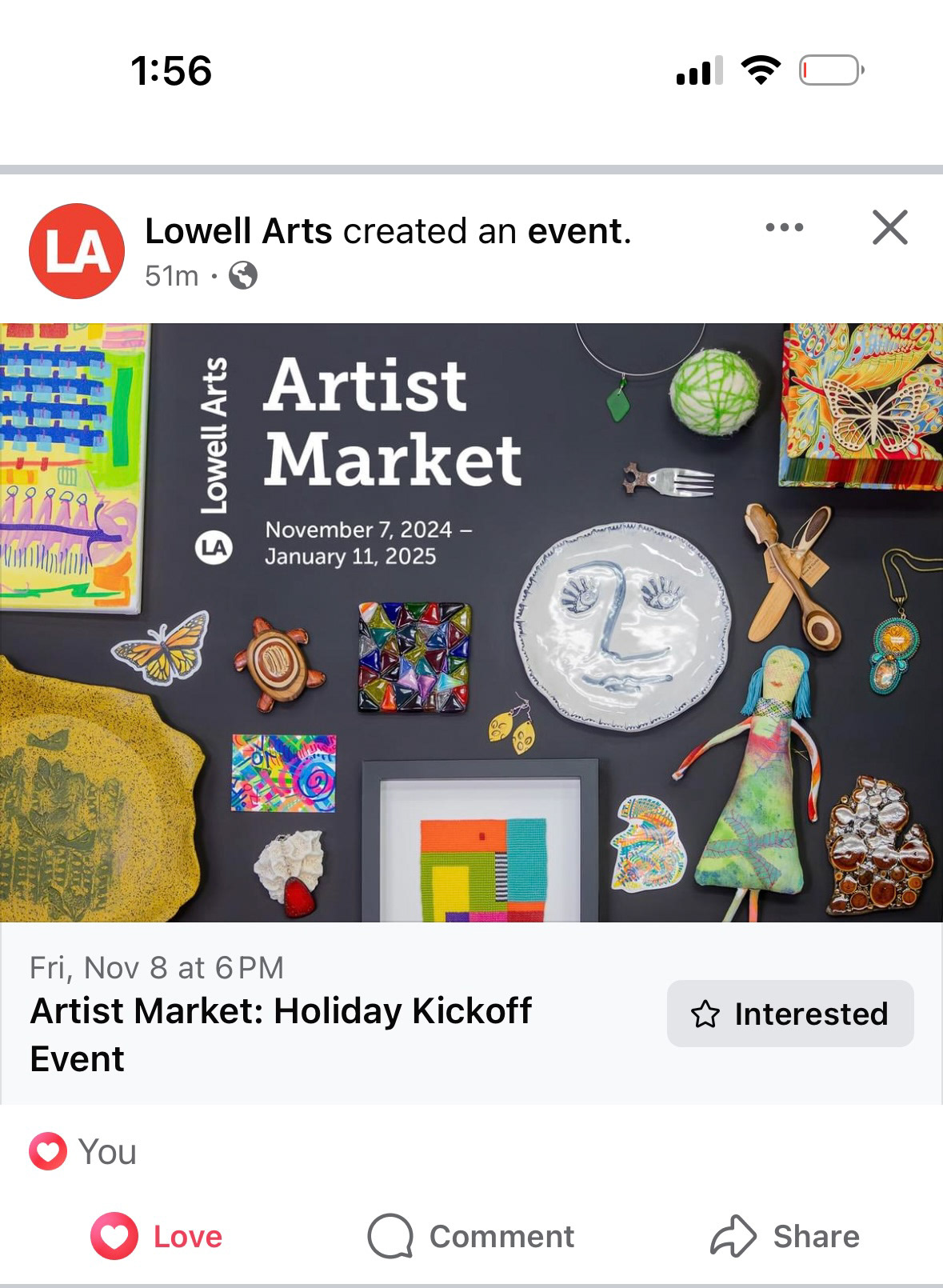
Using the photography that my team and I took, the Lowell Arts team was able to create eye-catching social posts showcasing items available for purchase at the Artist Market
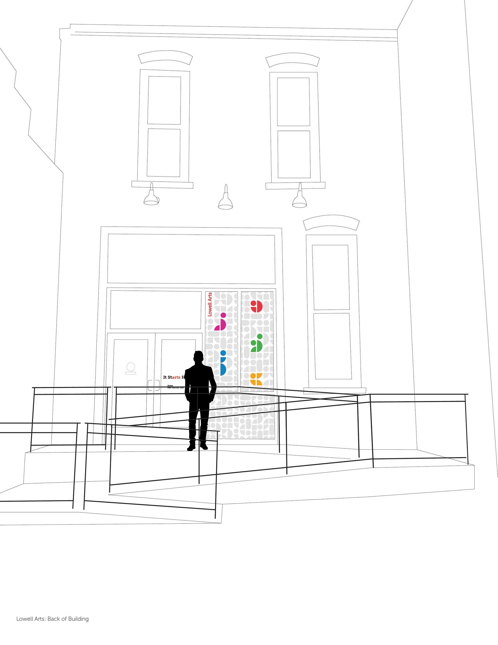
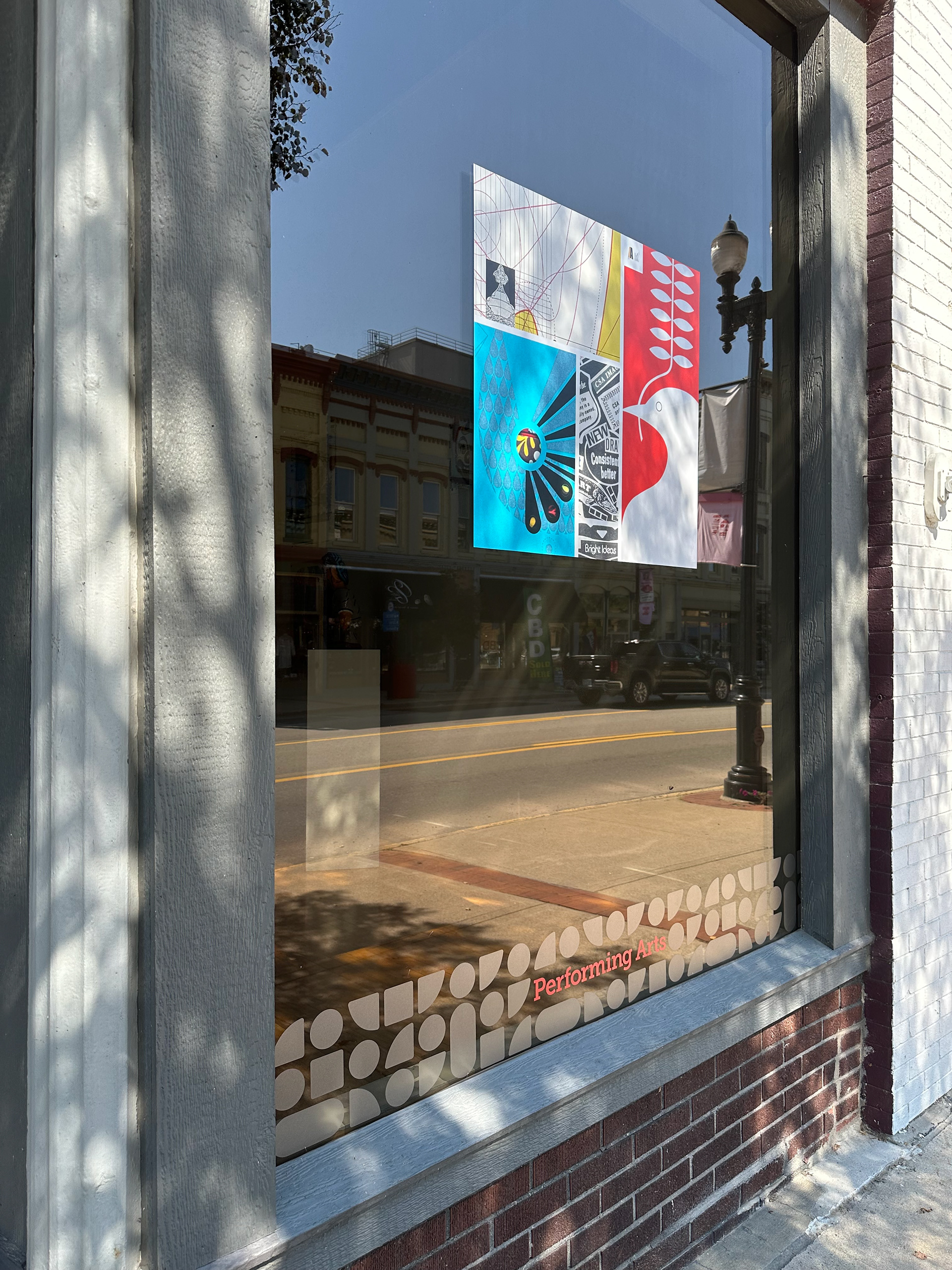
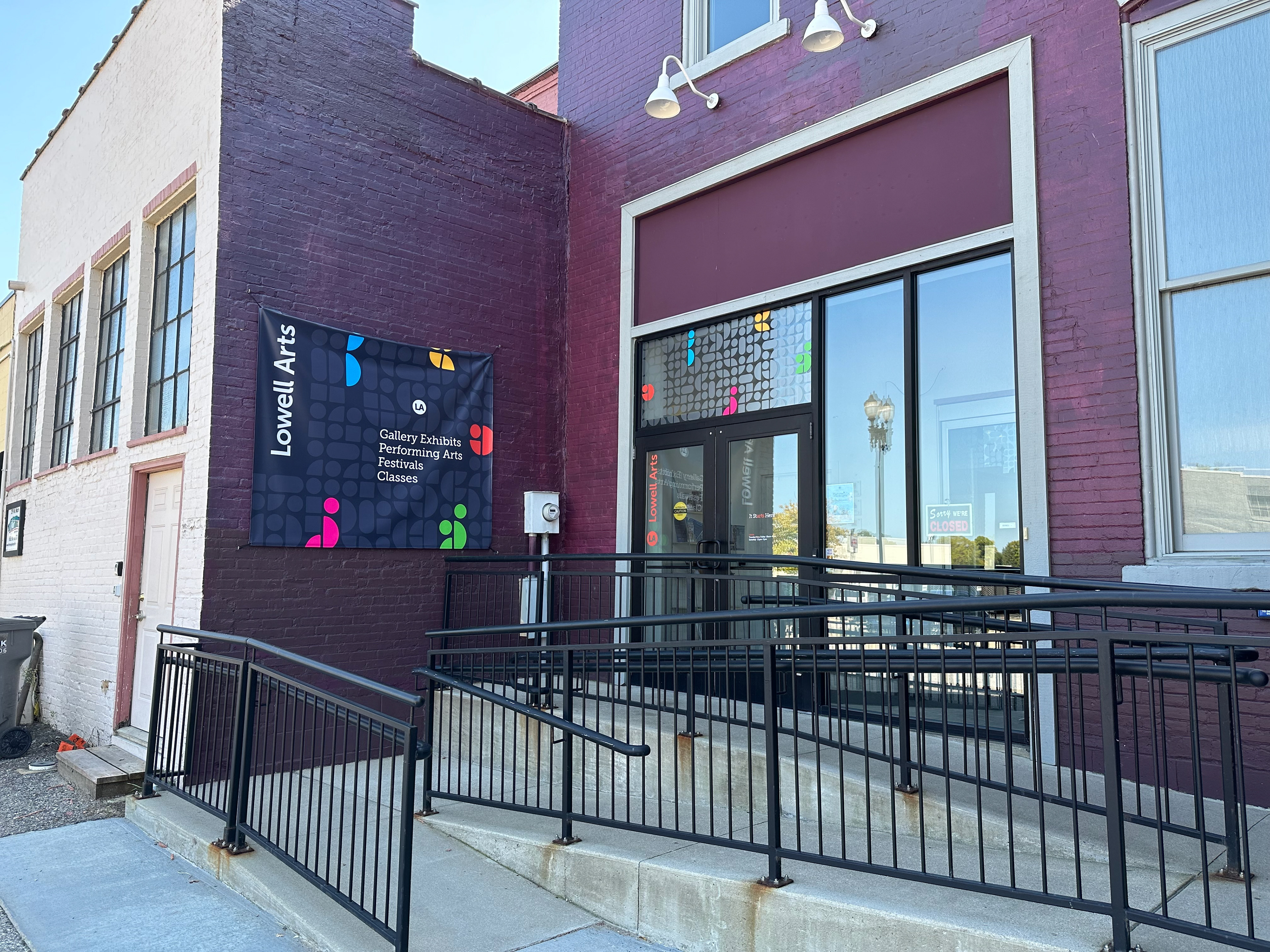
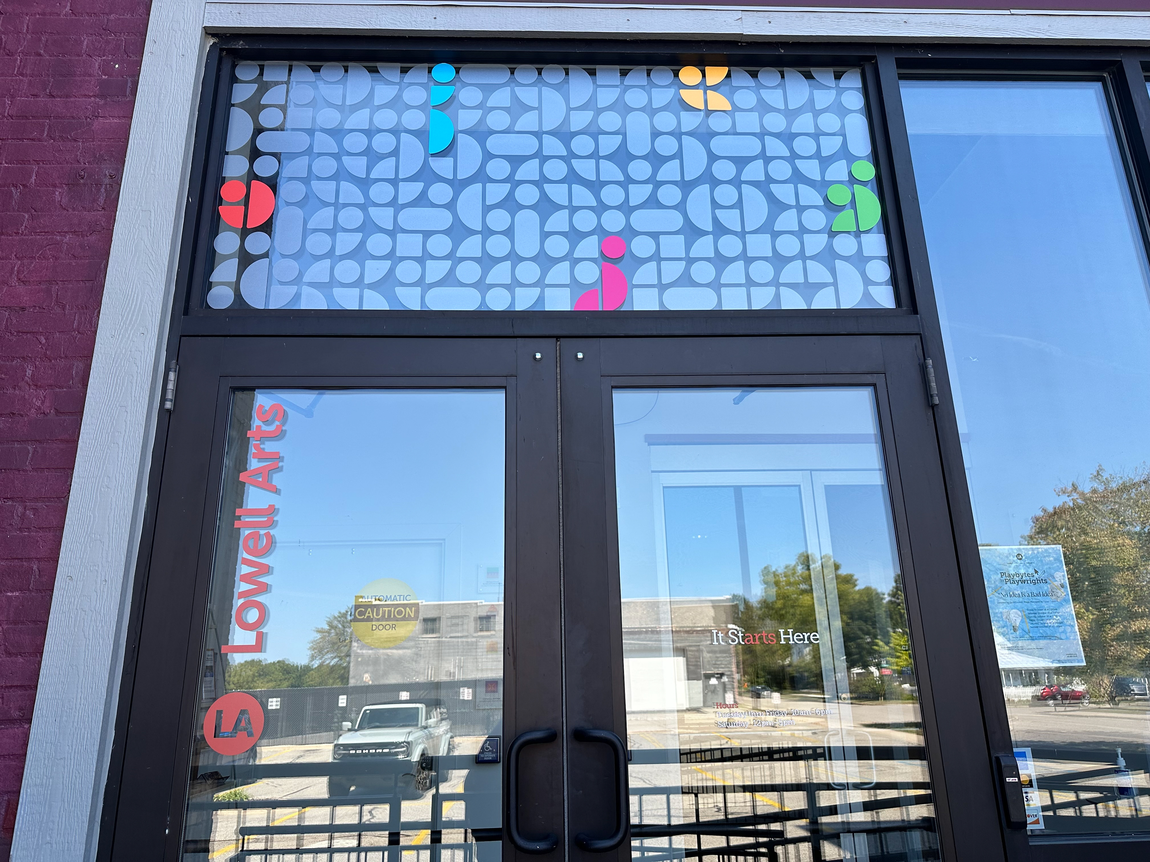
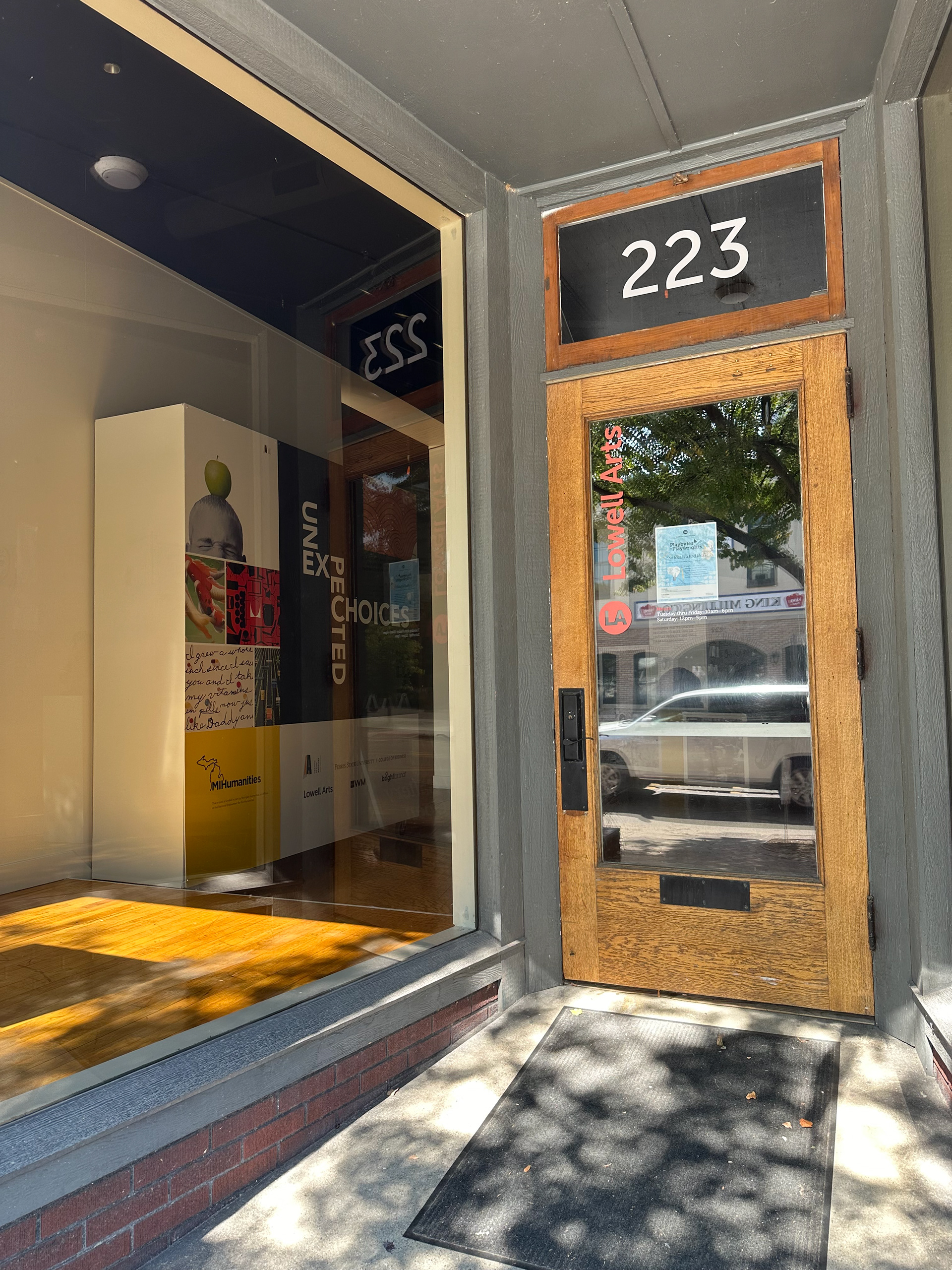
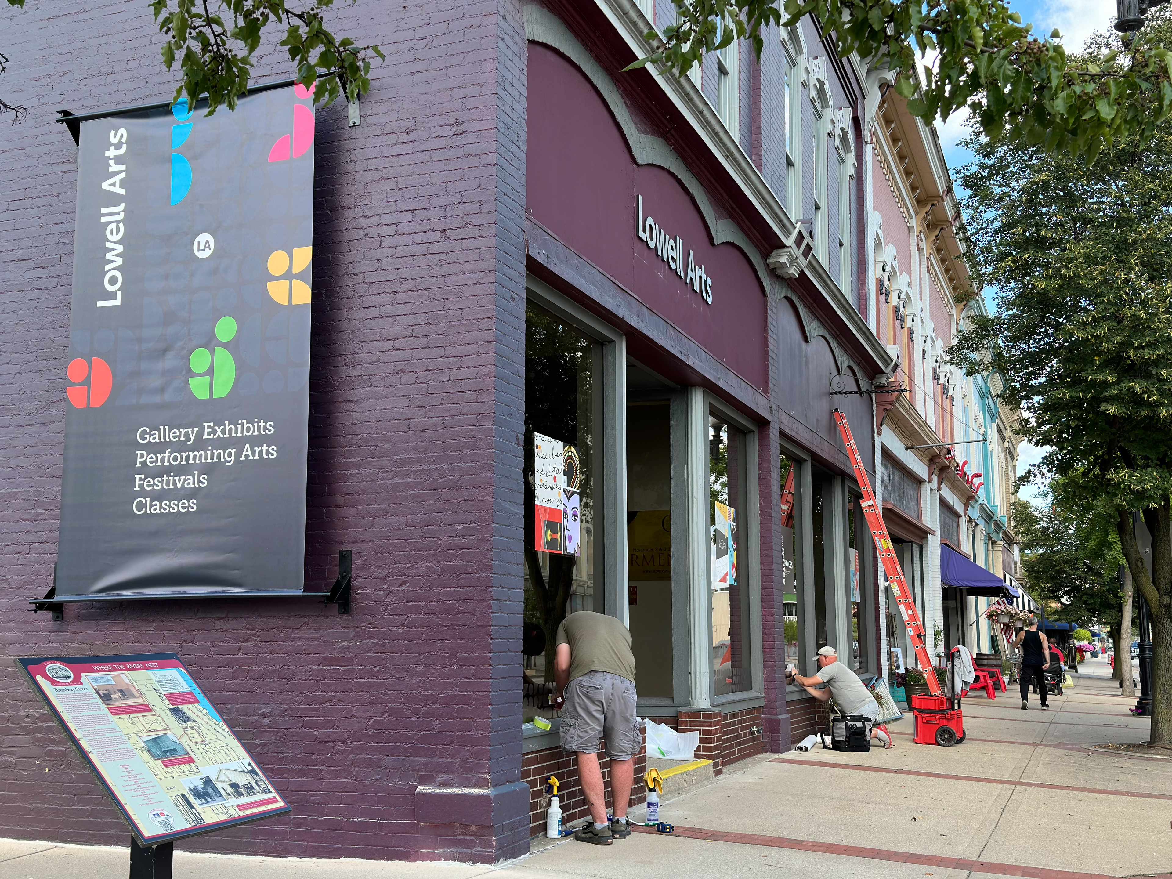
Environmental
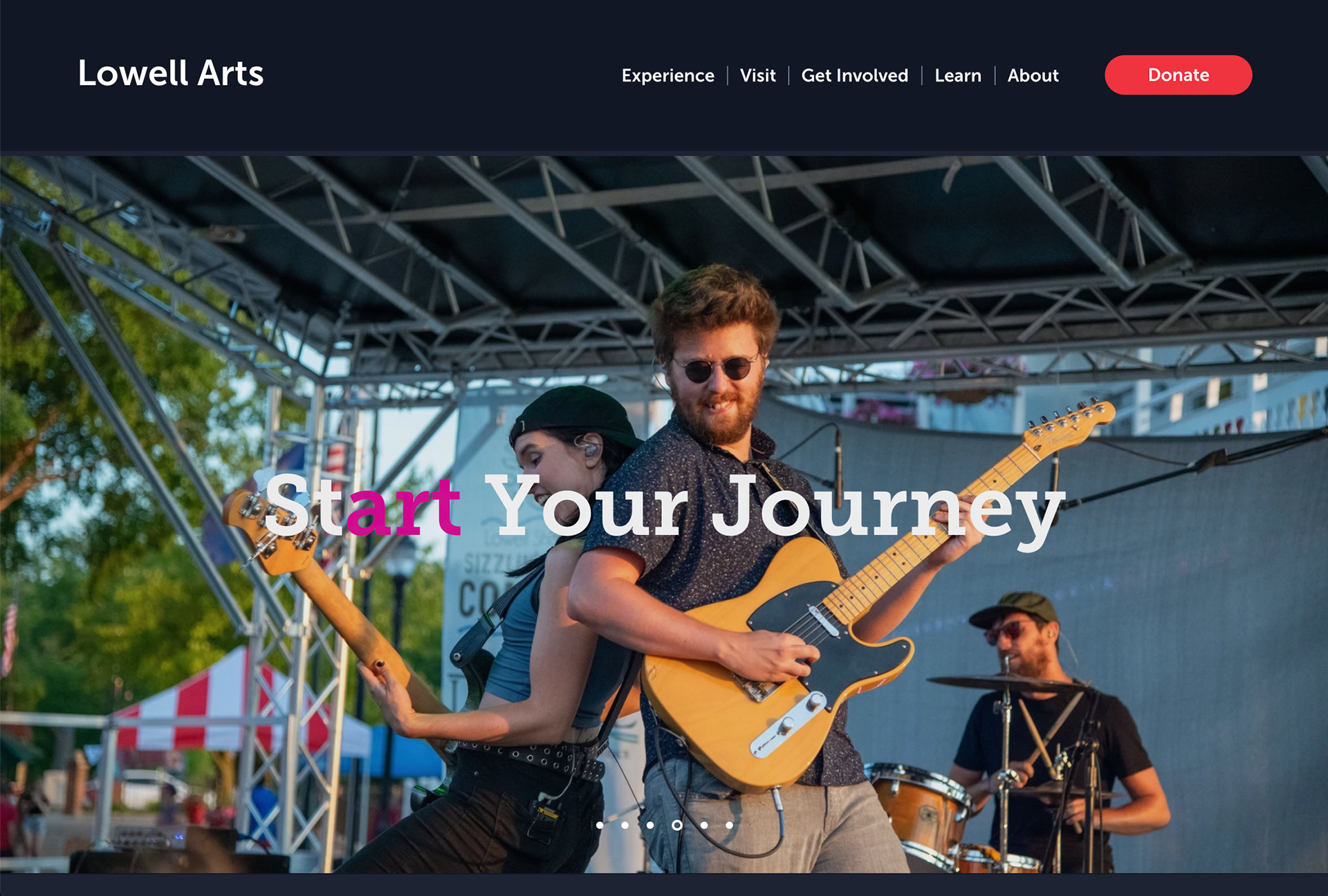
Website
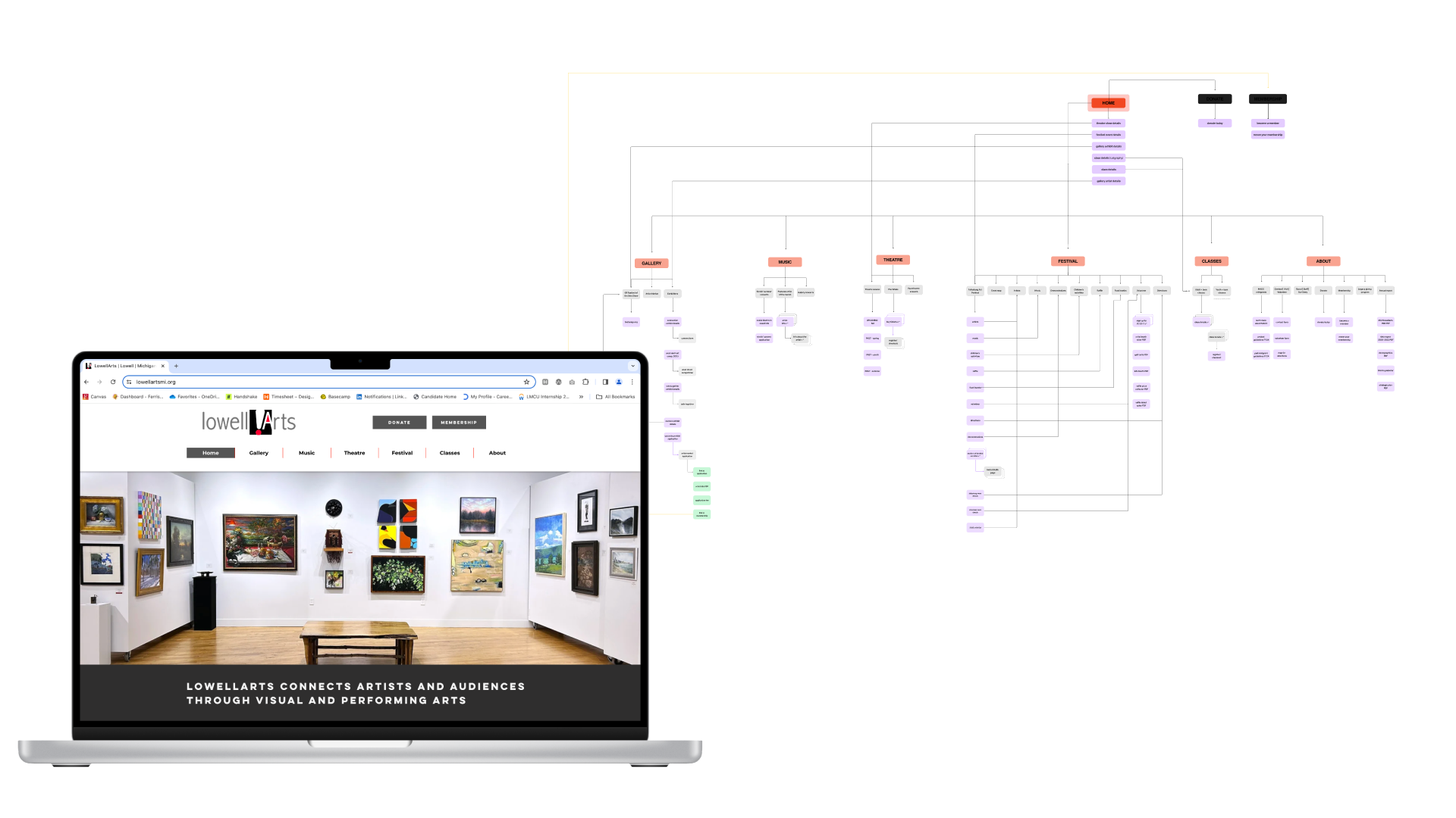
Audit
Going through their old website we noticed a lot of disorganization and the dated look.
It was important to the client that there was a way to view past events and their current layout did not allow for that.
New Website
Applying the branding and reorganizing the website, we condensed the number of clicks it would take a user to find what they were looking for and have a place to show archived events.

Internal Structure
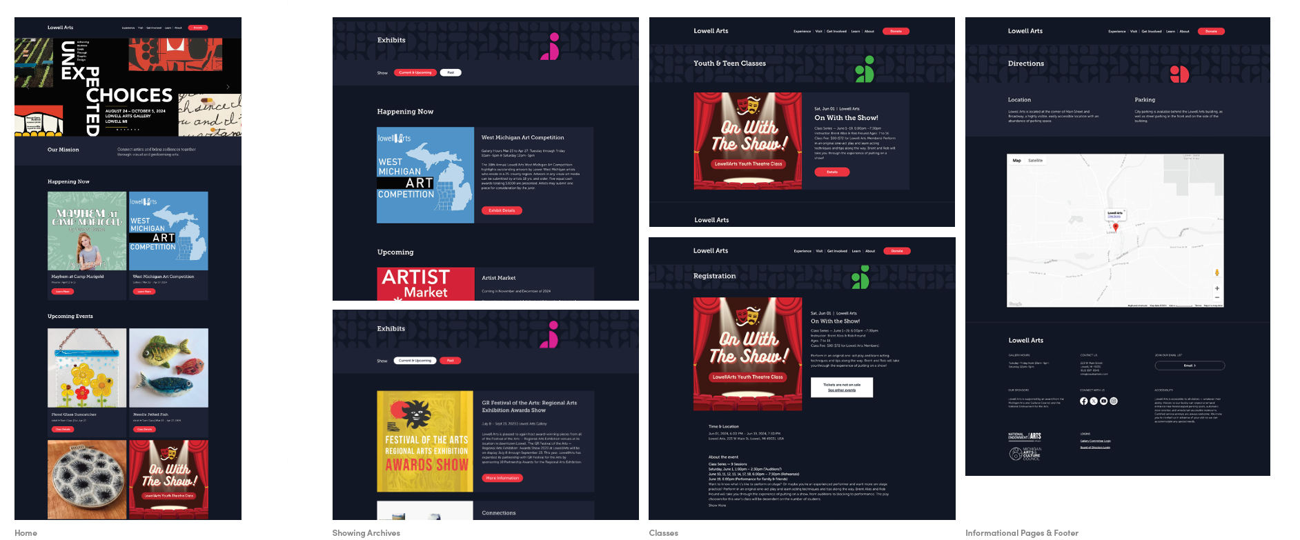
For the website, we created the banner graphics for the internal pages. Establishing what secondary, tertiary, and quaternary pages would look like.
Check out the website in action!
Brand Manual
At the end of this project, the client has a brand system and a set of guidelines that reflects the brand's mission, vision, and value, signals change and is an opportunity to connect with new audiences, and creates consistency across programs.

Talk of the Town
The Lowell Art's rebrand has been the talk of the town since its launch in August of 2024. Check out what people are saying: